Design System
VKontakte

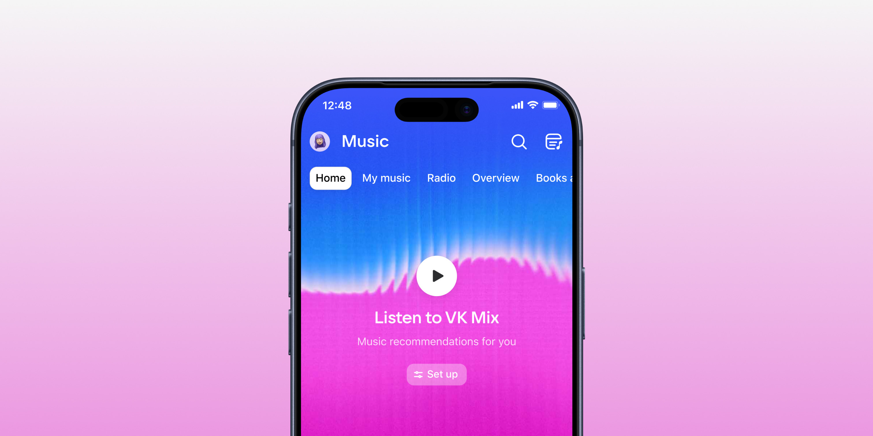
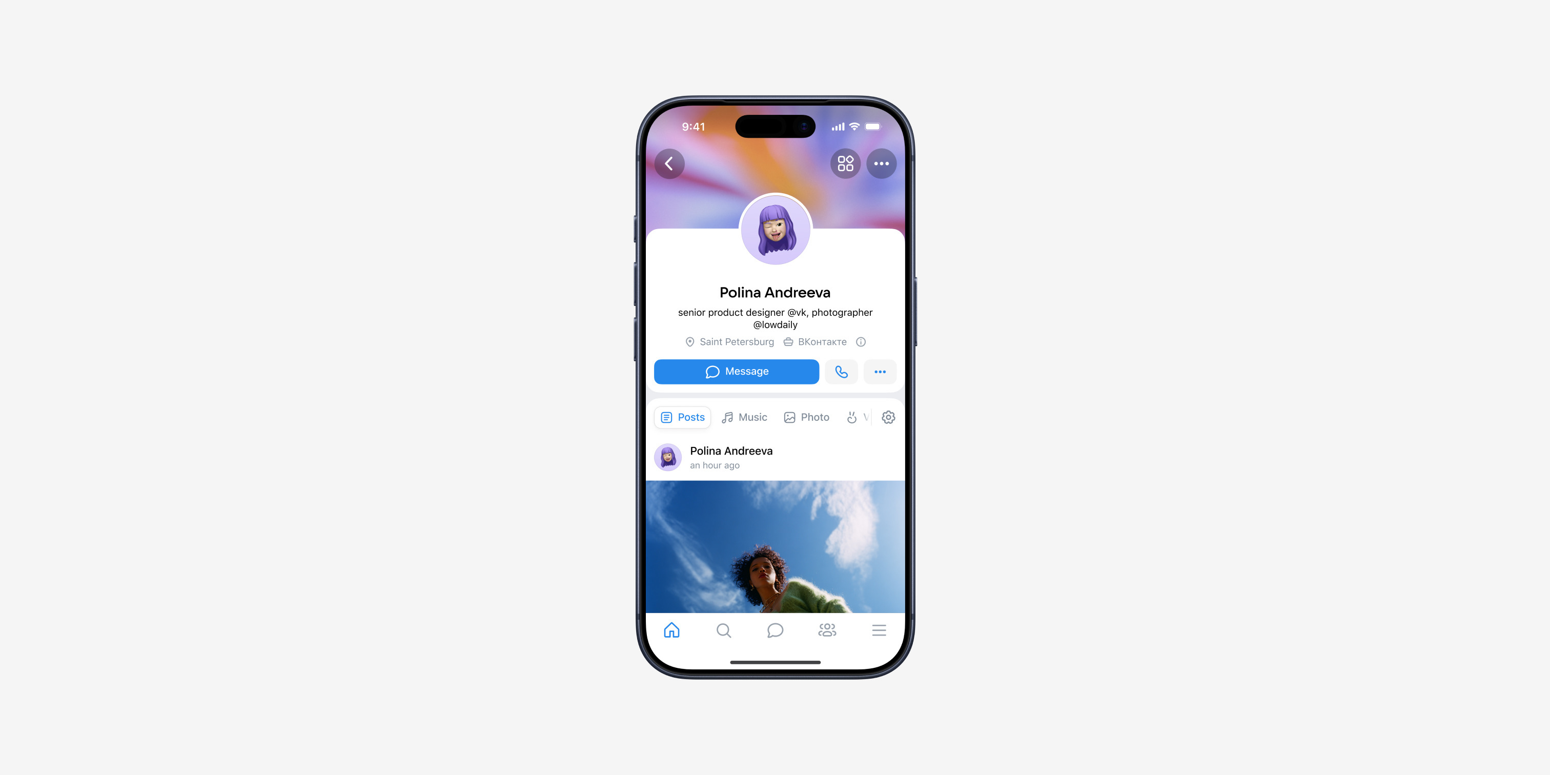
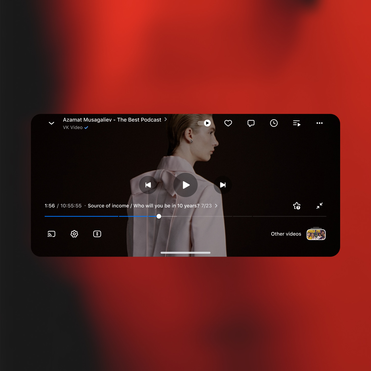
VK runs dozens of native products across iOS and Android, yet there was no single system behind them. Each platform lived in its own library: the same flow had to be drawn twice, styles and colors had piled up to the point where switching themes required plugins, and half the interfaces were custom. Most critically, the system existed only on the design side — engineering built screens on its own. The task was to create one foundation for two platforms and 15+ products.
From tokens to products
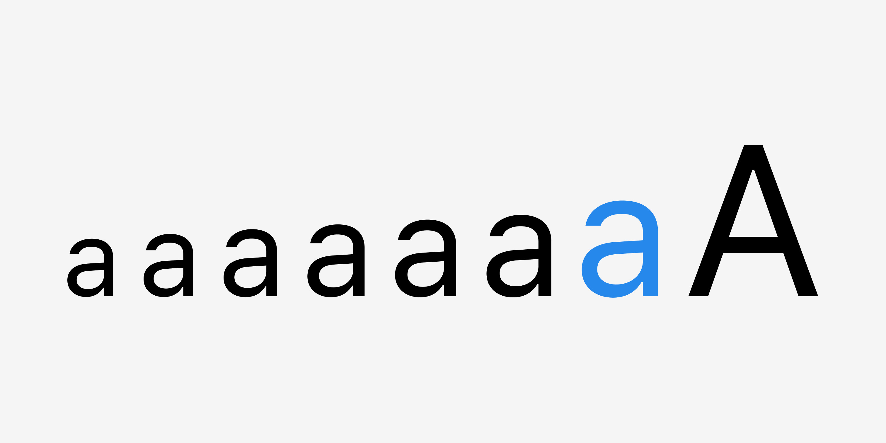
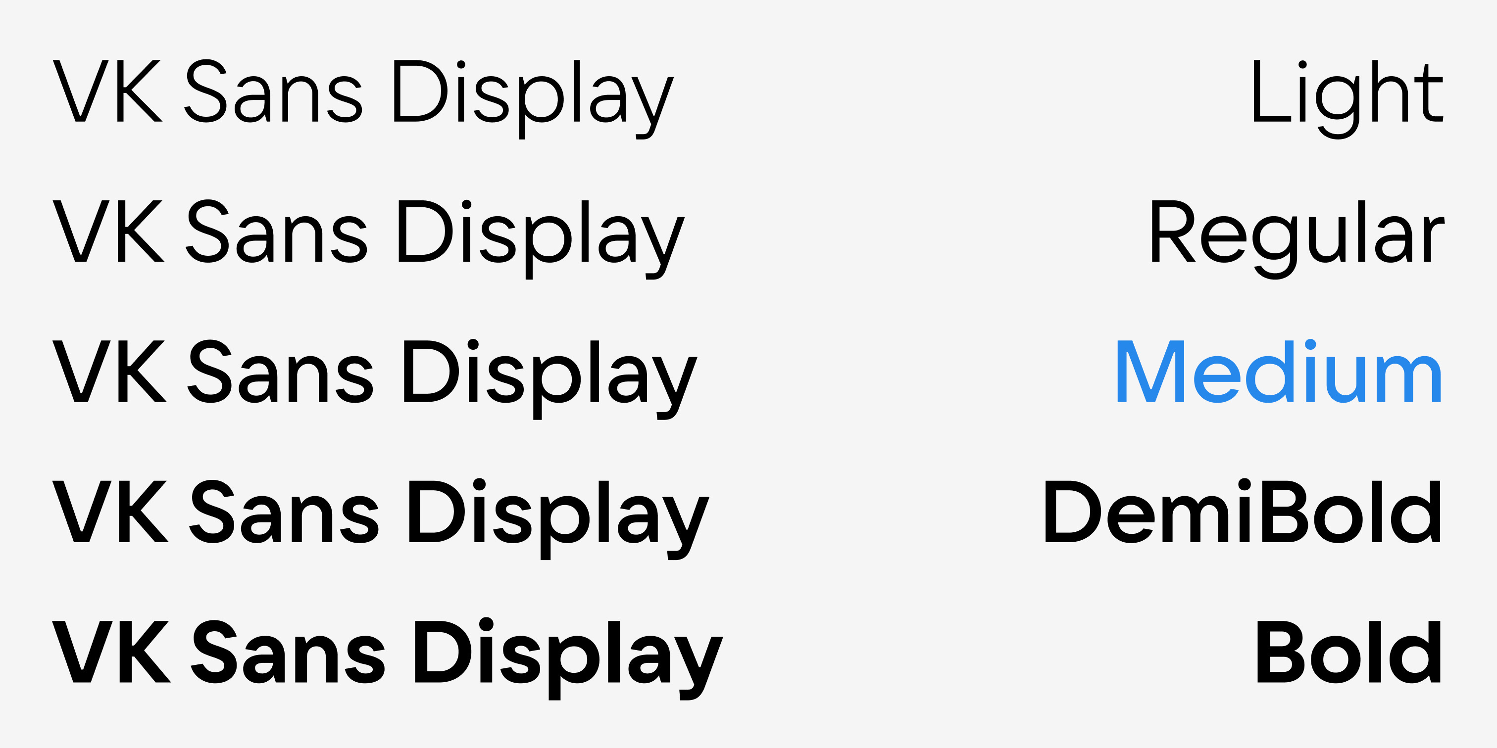
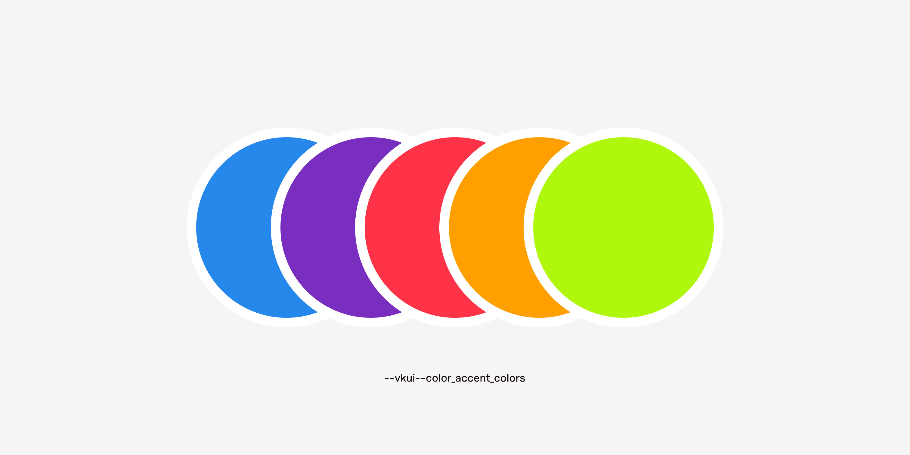
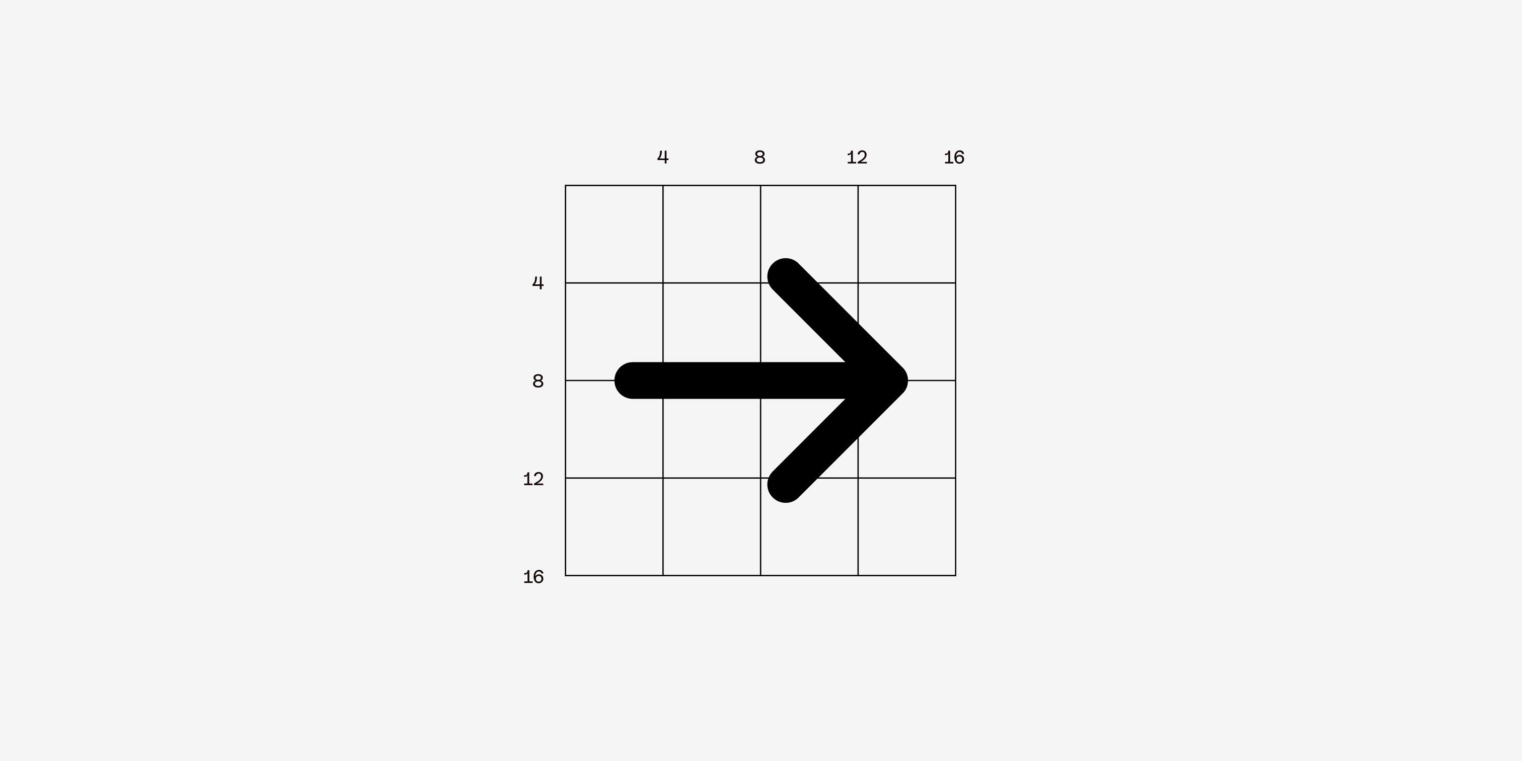
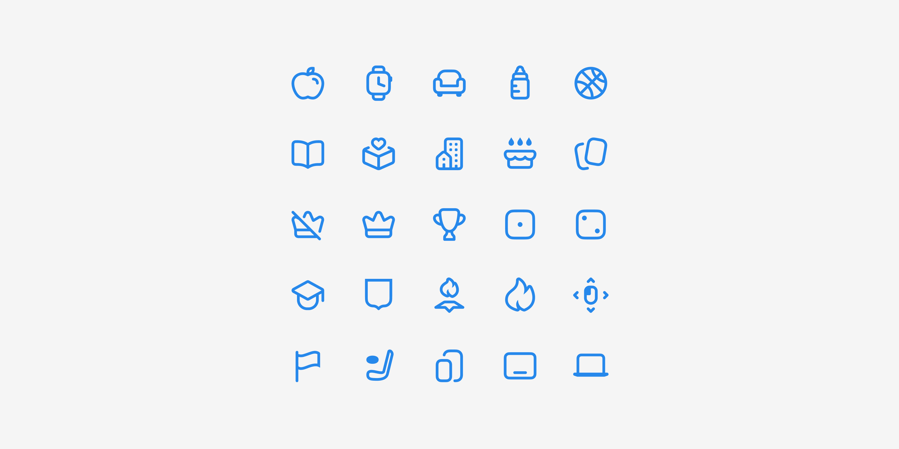
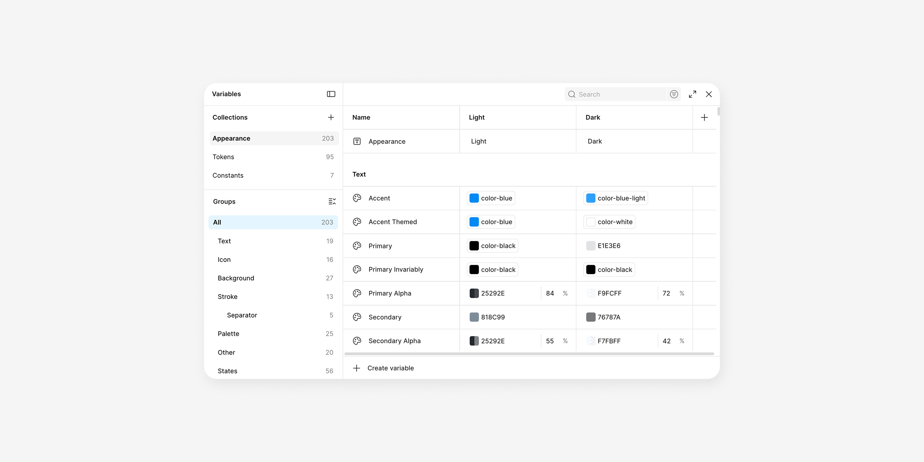
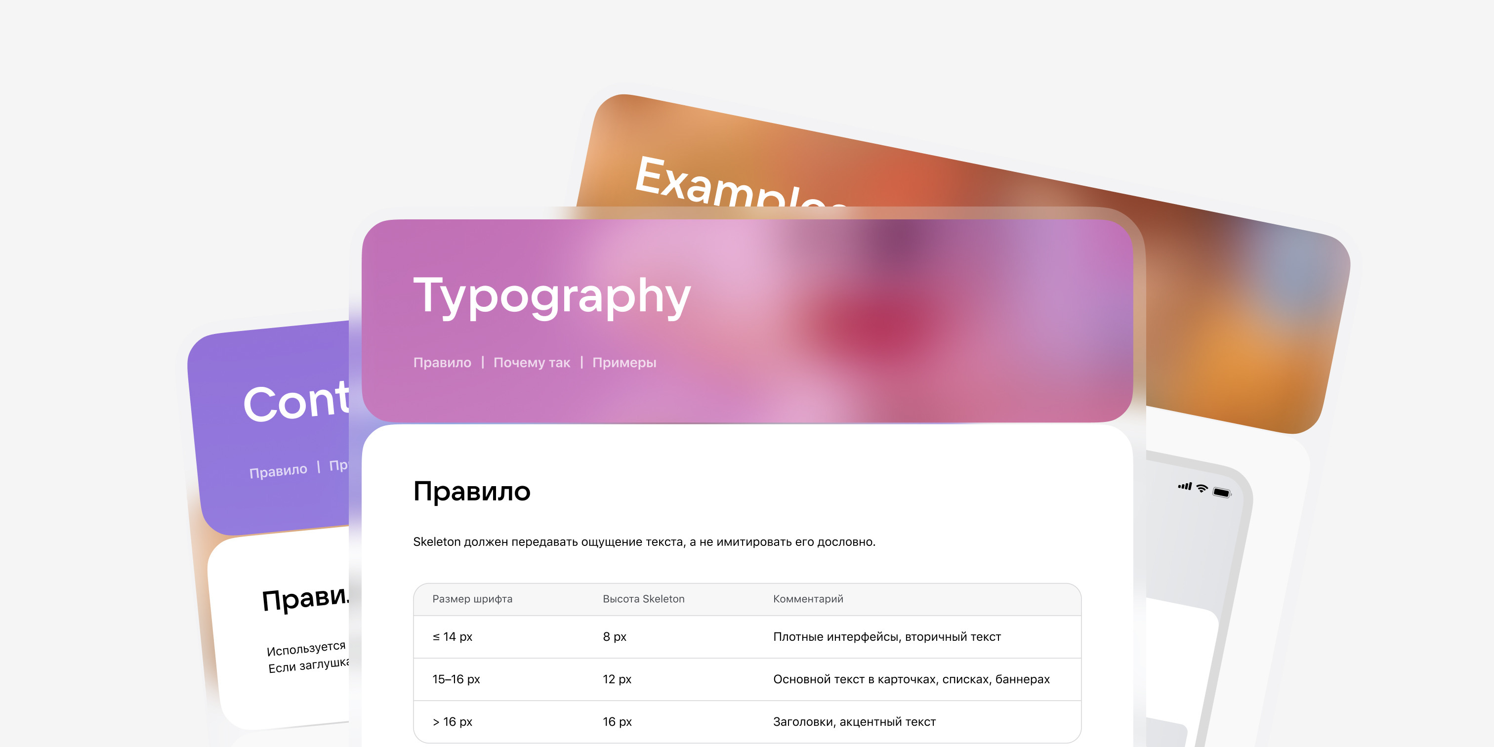
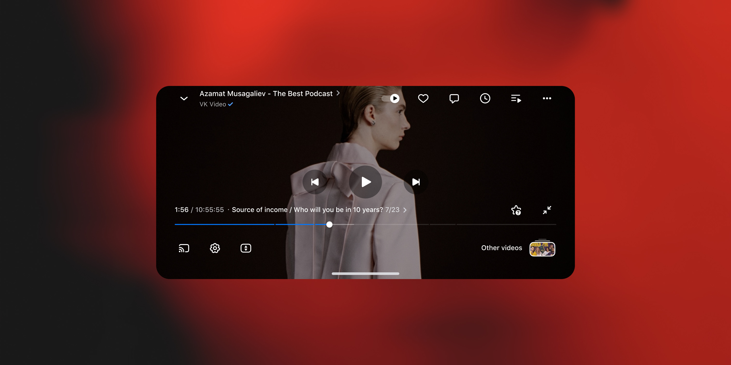
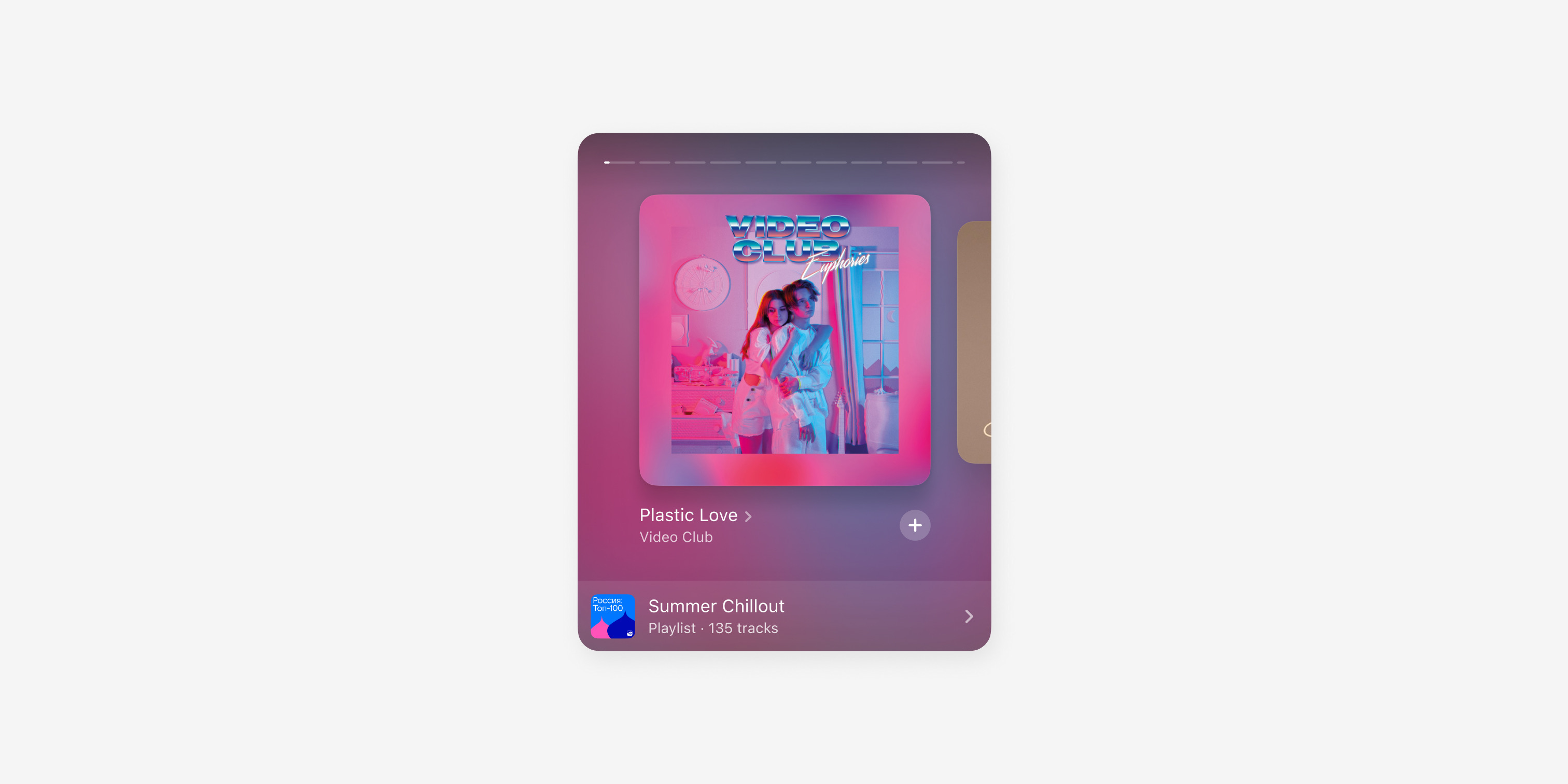
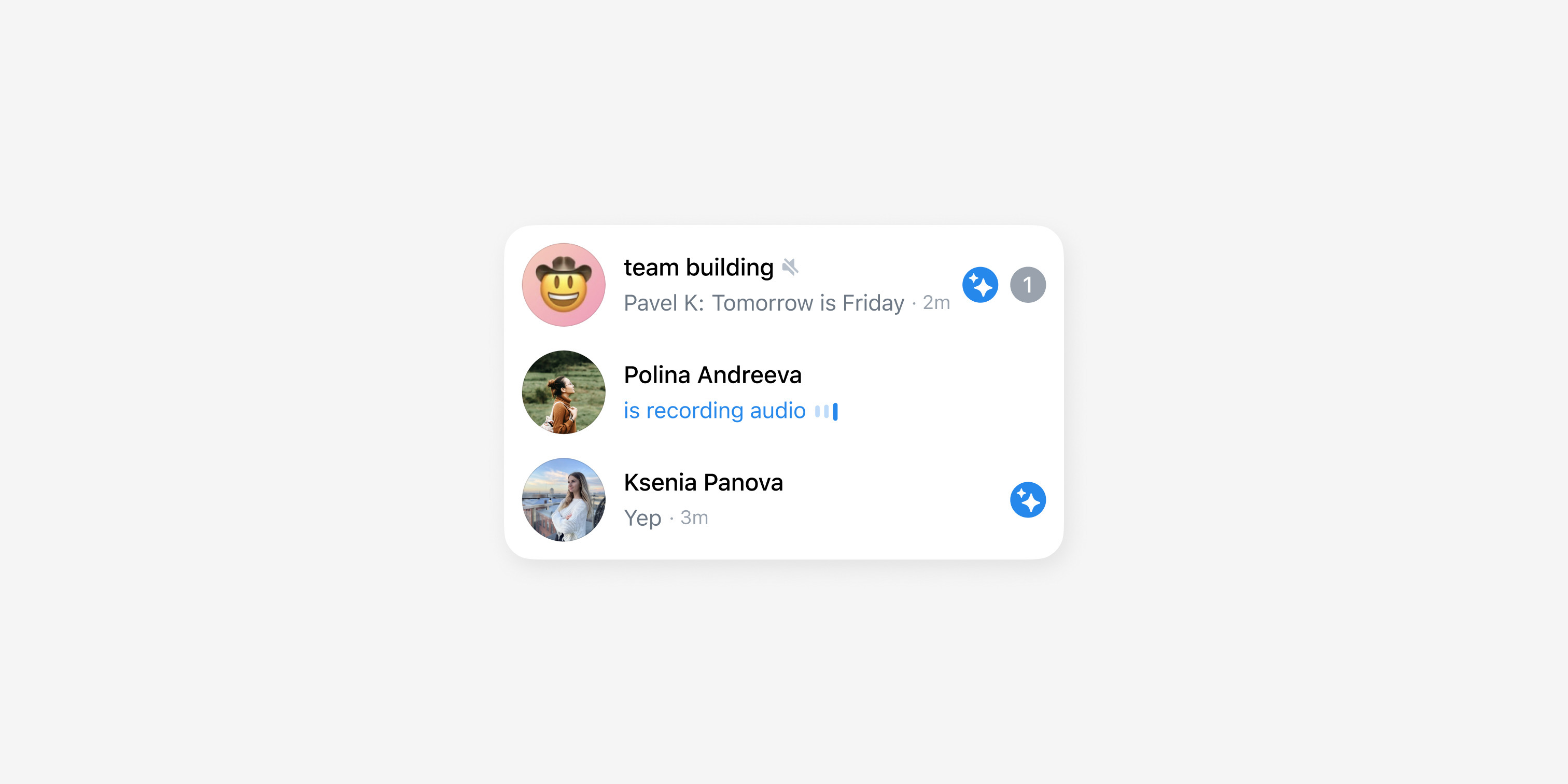
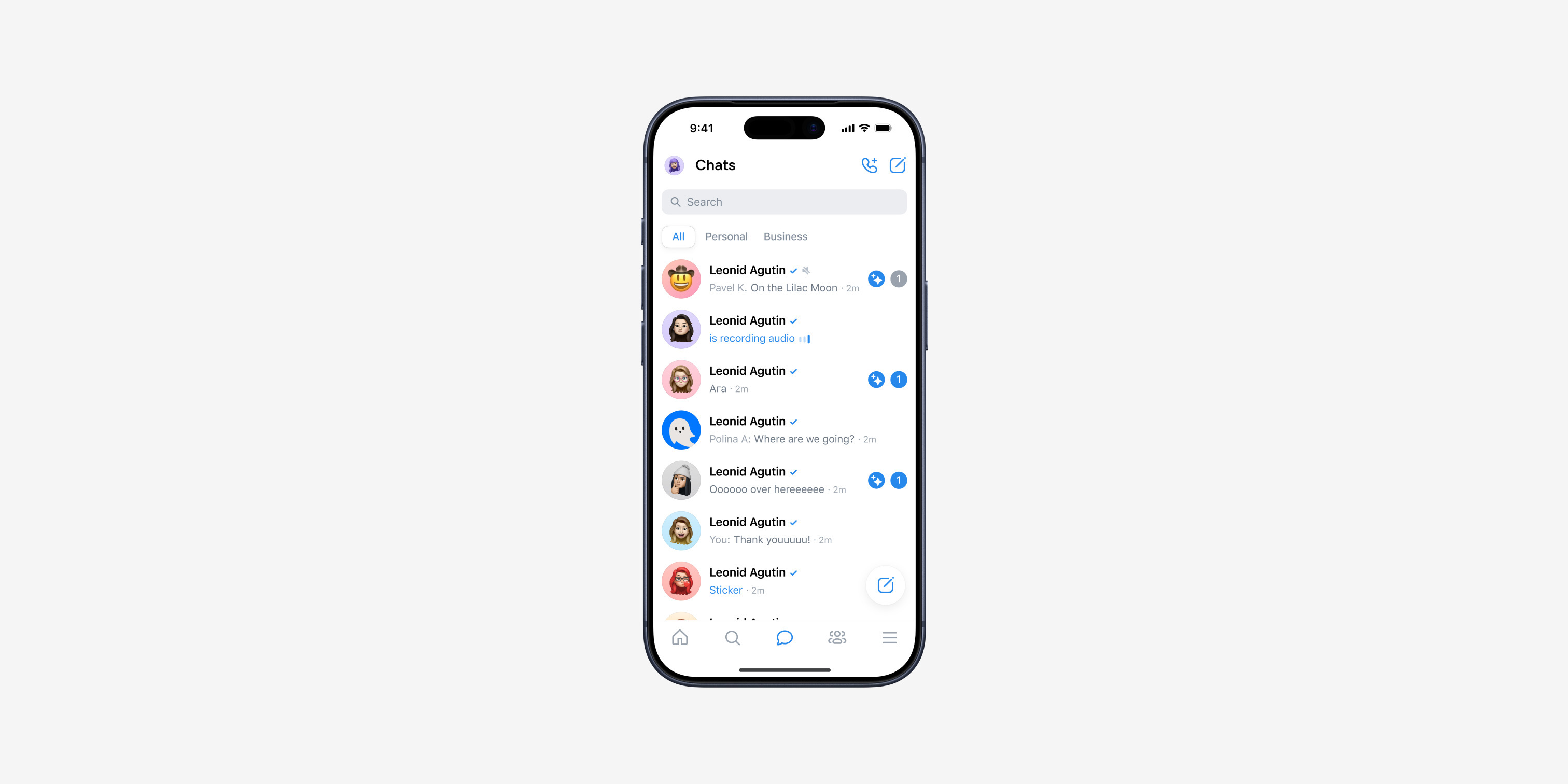
We laid a single token base: two layers, Appearance for color and Tokens for values, with everything else referencing them. We reduced the overgrown legacy typography to a compact set of styles. We rebuilt color from scratch — organized into categories (Text, Icon, Background, Stroke, States, Gradient) with shades tuned for light and dark themes. We rebuilt 40+ components on variants — lean, with no excess, so the system stays fast — and wrote a guide for each one. Then we connected design and engineering: synced the system with code, started migrating products onto shared components, and introduced a design review process.

One language across
all VK products
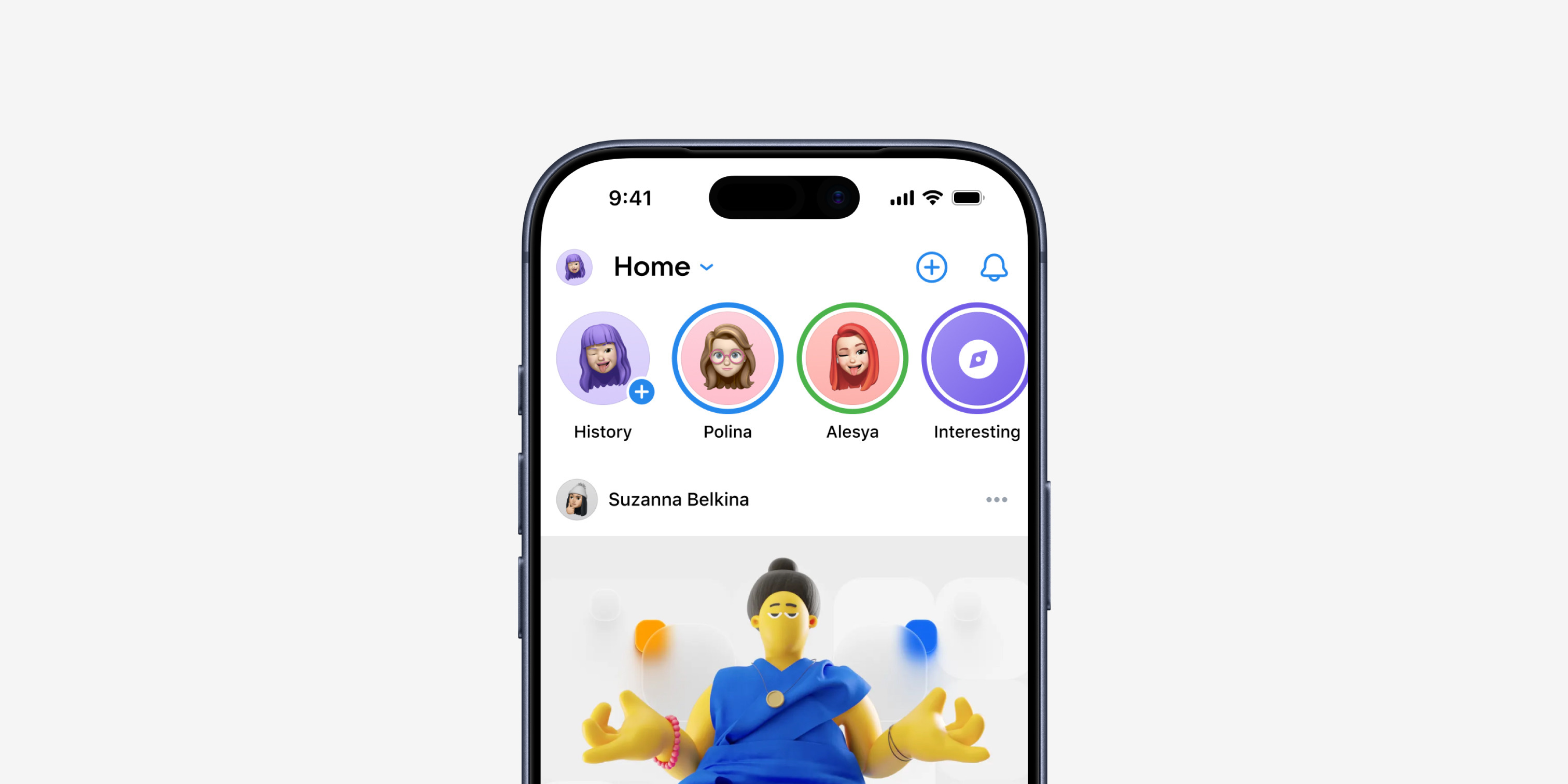
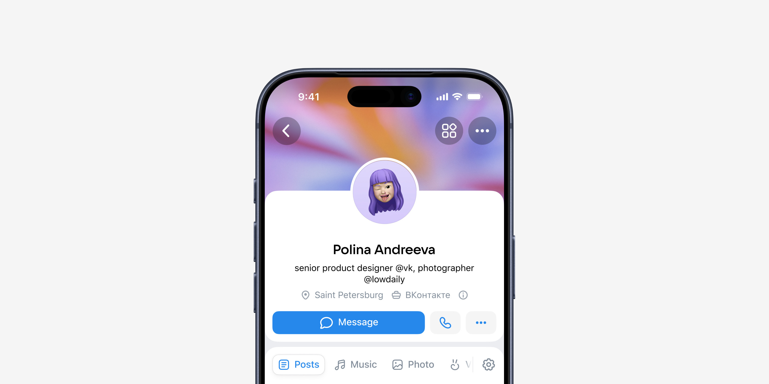
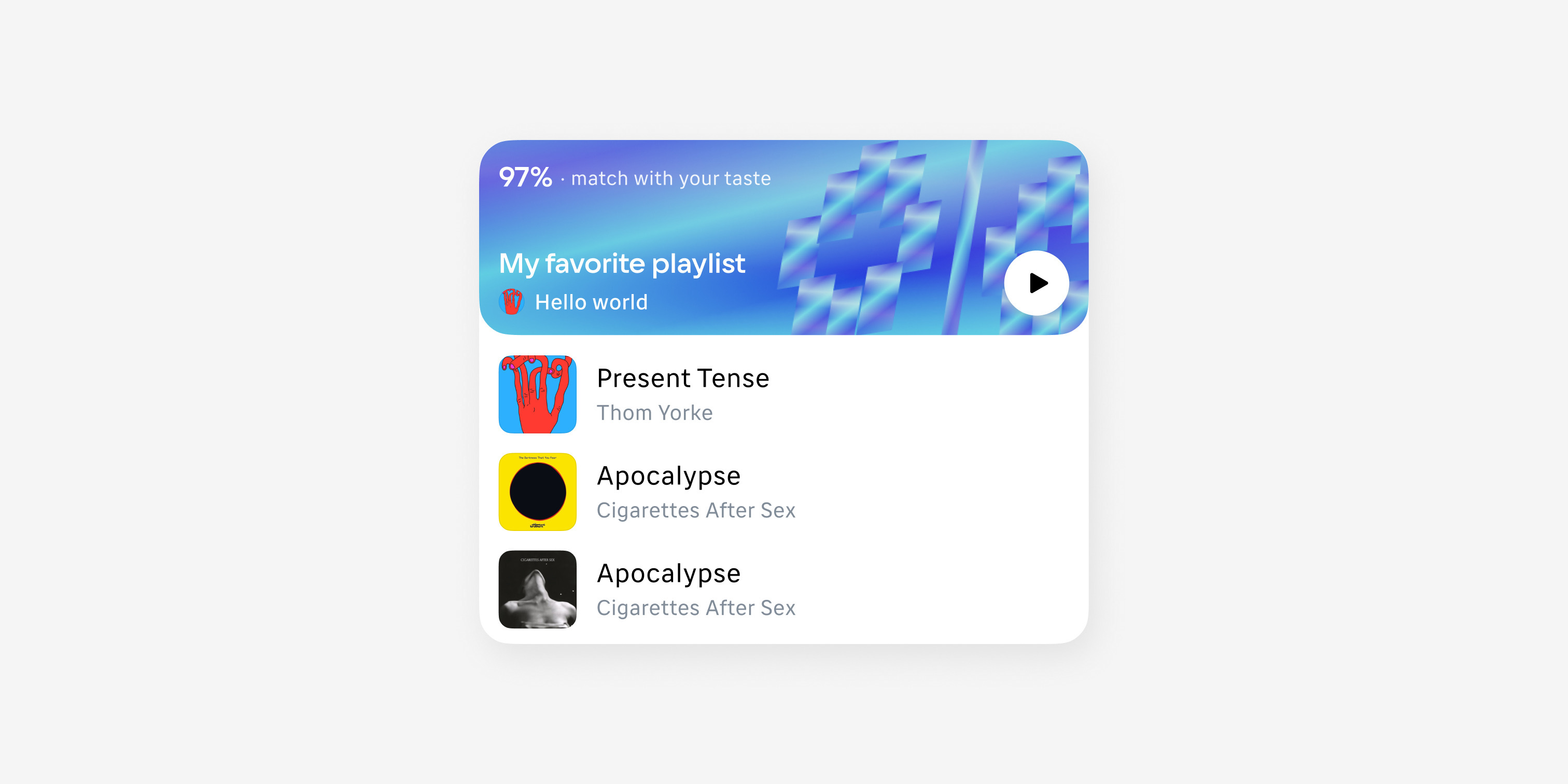
A set of platform-specific libraries became one native system behind every VK product. Design and engineering now speak the same language, products are moving onto shared components, and theme switching works out of the box.
 NDA
NDA
 Coming Soon